Global Human Day
Exploring how people across the world spend their 24 hours
I completed this project with one other person for Cornell's INFO 4310: Interactive Information Course in Spring 2024; my main responsiblity was handling the central scatterplot and implementing animated transitions. The aim of the project was to pick a dataset of interest currently only represented online in static plots, and then create a web-based interactive visualization using D3.js.
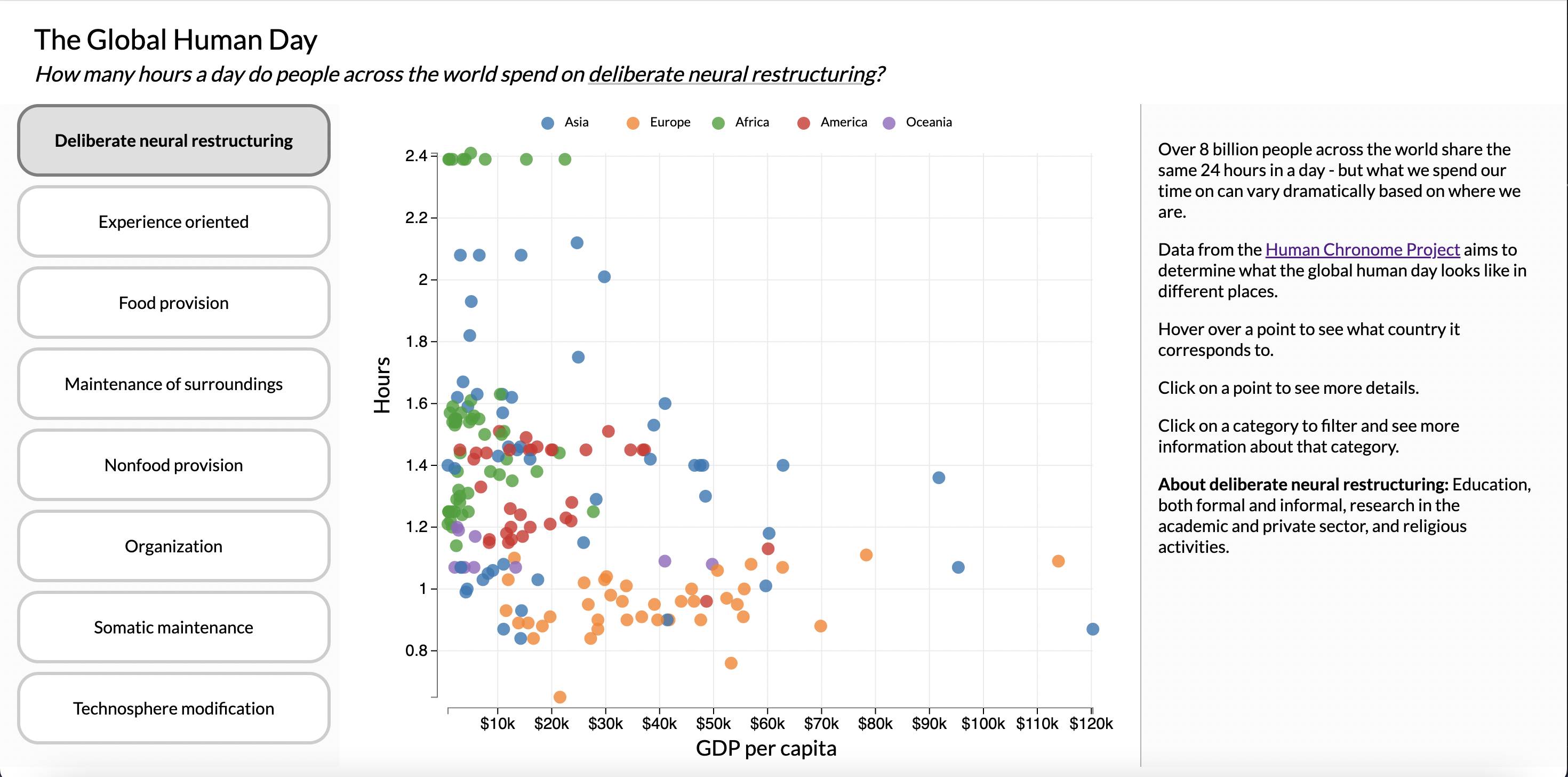
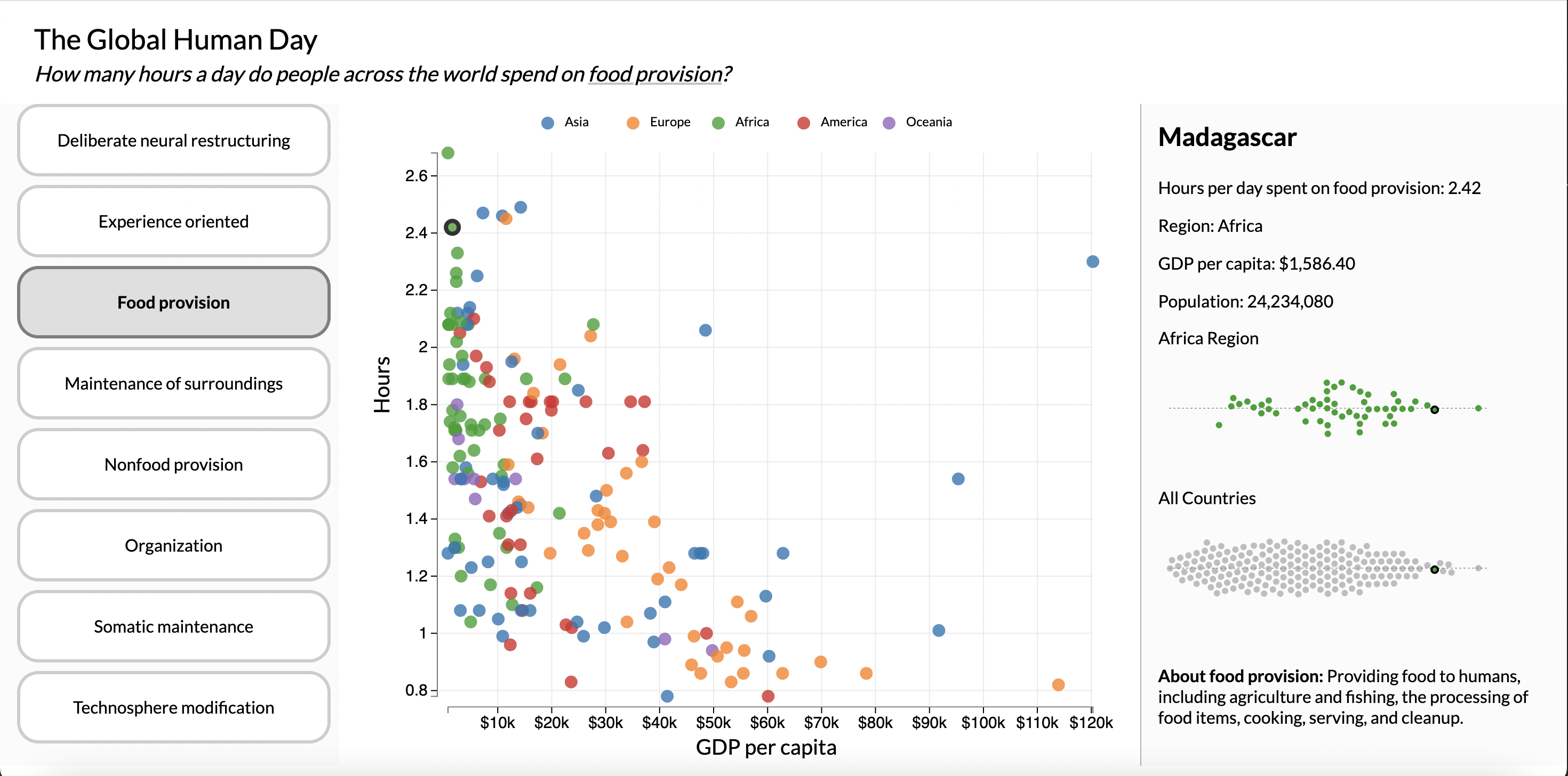
We settled on a dataset from the Human Chronome Project, a comprehensive study aiming to quantify patterns in human behavior across the world. More specifically, the study estimates how people in different countries tend to allocate their time across the 24 hours in a day, split across eight categories: 1.) deliberate neural restructuring, 2.) experience oriented activities, 3.) food provision, 4.) maintenance of surroundings, 5.) nonfood provision, 6.) organization, 7.) somatic maintenance, and 8.) technosphere maintenance.
While we were able to find some examples of static visualizations of the data online, we did not encounter any interactive graphics. We were interested by the static scatterplots produced by the study comparing hours spent per activity vs. GDP per capita across all countries, and sketched several ideas on how to represent this data in one interactive visualization.
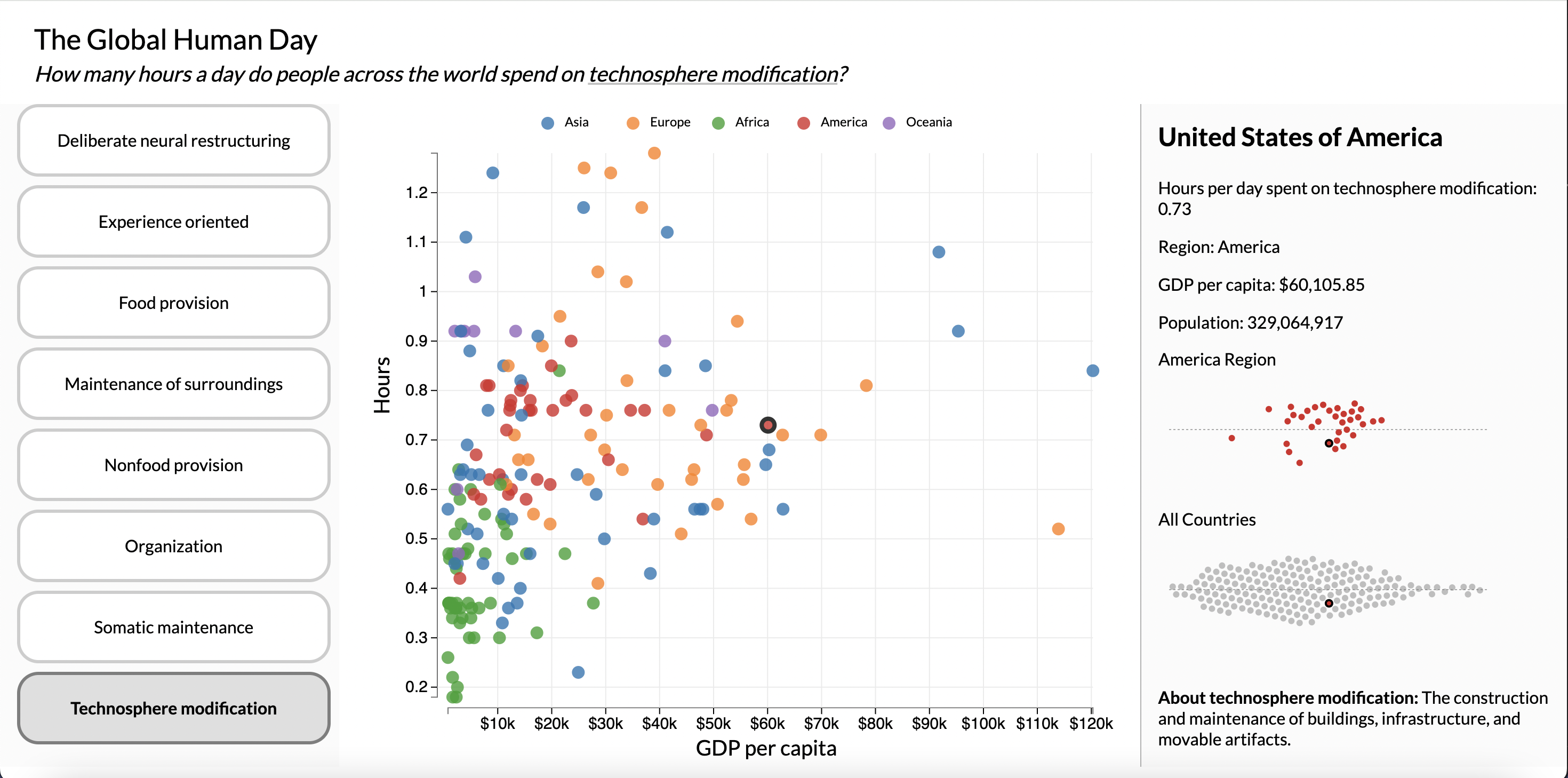
In the current version of the site, users can switch between categories to see how countries across the world compare in how they spend their time. Of note is how countries with higher GDP per capita visibly appear to spend more time on experience-oriented activities and technosphere maintenance, while countries with lower GDP per capita spend more time on food and nonfood provision.
Countries can also be hovered on or clicked to see more information about where they stand relative to other countries in the same region and relative to the world.
While all the main features we sketched out during the planning phase were implemented, I'm still planning on revisiting this project and refining it even more - for example, making the interface more responsive on different screen sizes, allowing the ability to search for a specific country by name, and adding more stats for a country on how they specifically compare with other countries.