Cornell Crime Map
Geocoding and visualizing campus crime logs
I worked in a group of four students to complete this final project for Cornell's INFO 3300: Data-Driven Web Applications in Fall 2022. My main responsibilites were finding and converting GeoJSON files for use in the map, coding the site layout, and implementing clickable points on the map that display information about each crime.
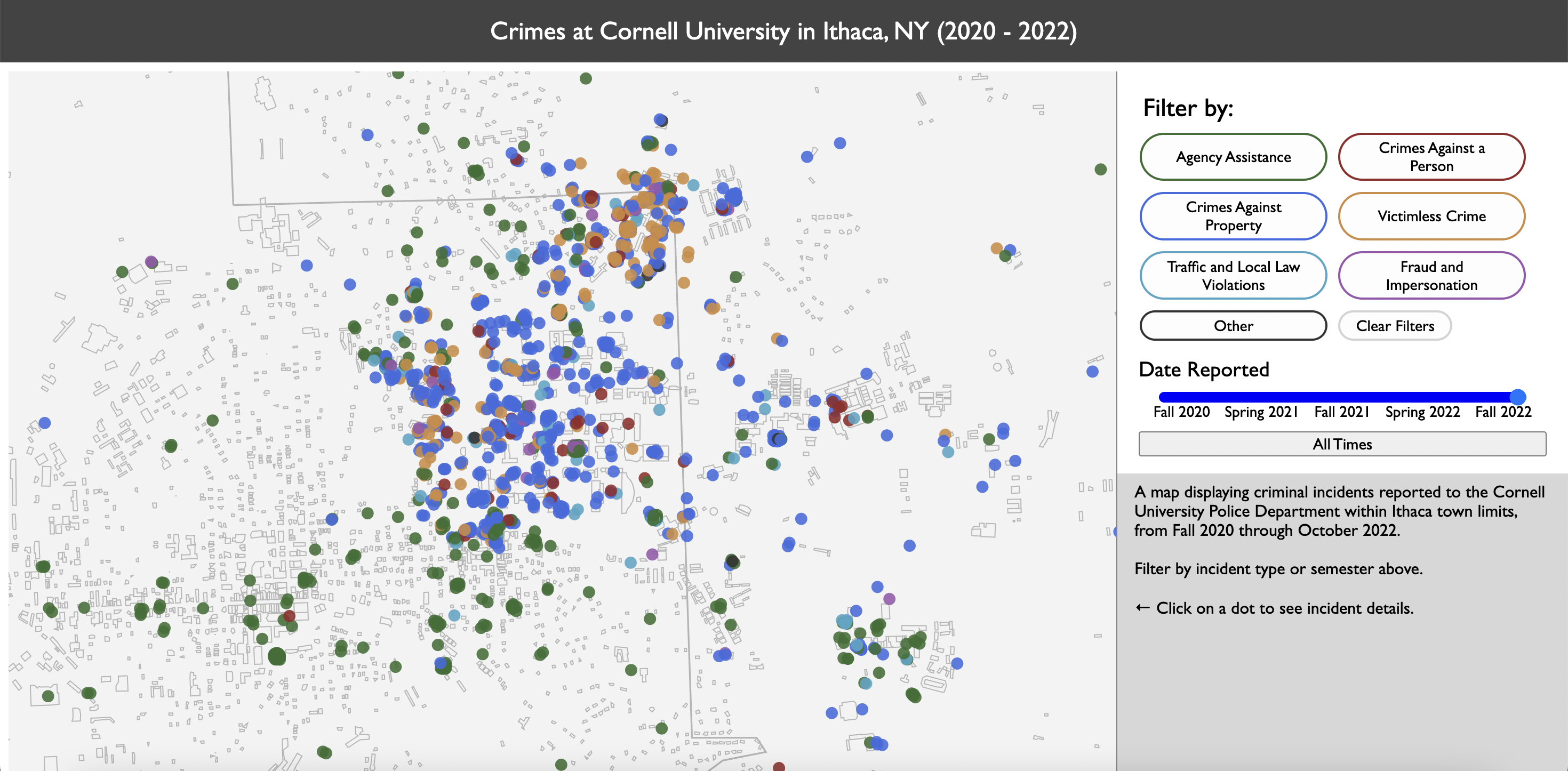
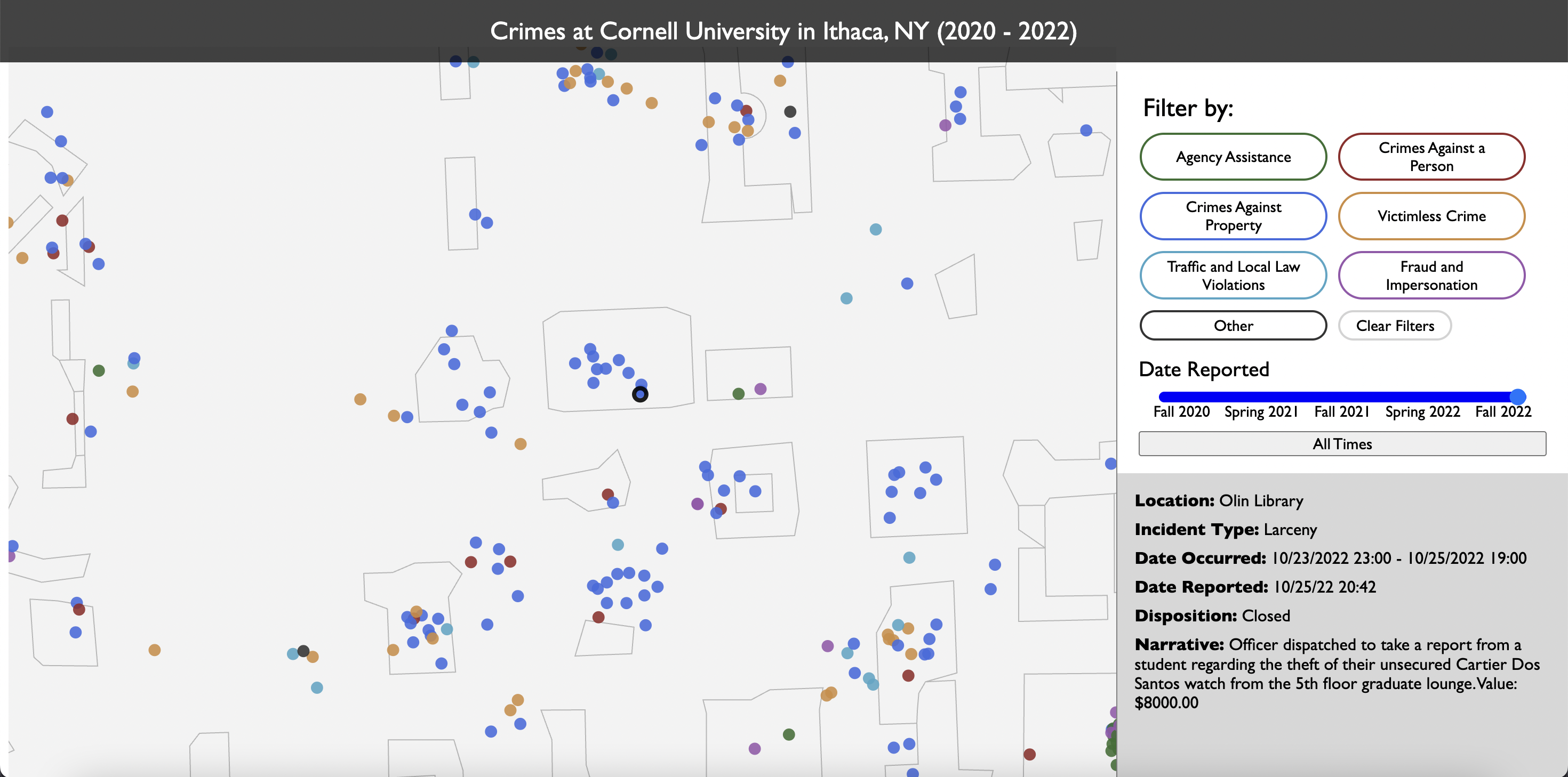
This aim of this project was to complete an interactive visualization for a dataset of our choice, solely using D3.js (and without any external mapping libraries like Leaflet or Mapbox). At the time, there was quite a bit of talk among students about a recent increase in crime alert emails - so we thought it would be especially interesting to take a look at how crime incidents were unfolding on campus through a map.
The main challenge of this project quickly became clear once we started looking into the available data. Information related to campus crimes is provided through the Cornell University Police Department's Daily Crime Log, a web page that lists incidents only from the last 60 days. Furthermore, the data was displayed in an HTML table with each column containing mostly unstructured text; locations were also provided mostly as building or street names, with no easily mappable coordinates.
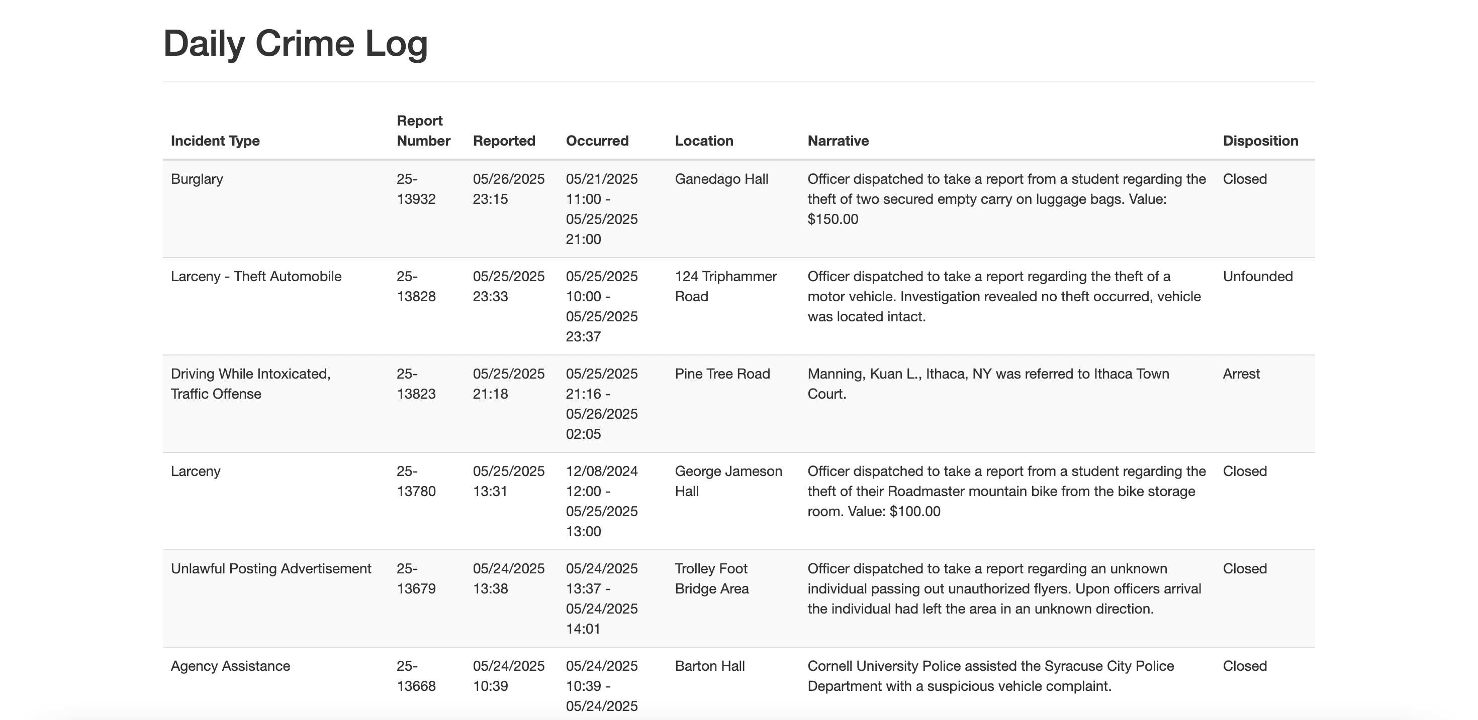
In order to address the lack of long-term data, we used the Internet Archive's Wayback Machine to retrieve archived versions of the Daily Crime Log and scraped the data from these pages. In this manner, we built up a dataset composing two years of reported campus crime incidents.
To address the lack of directly mappable location data, we used a free geocoding API to convert our location text into coordinates. This handled most of our data, but we still had to manually geocode about 300 locations that were not recognized by the API and then manually adjust locations that were erroneously geocoded.
Due to the unstuctured nature of the data, the crime logs originally had over 40 unique values for a crime's incident type. We used Python to clean up the data and group these incident types into 7 categories to support filtering in our visualization later on.
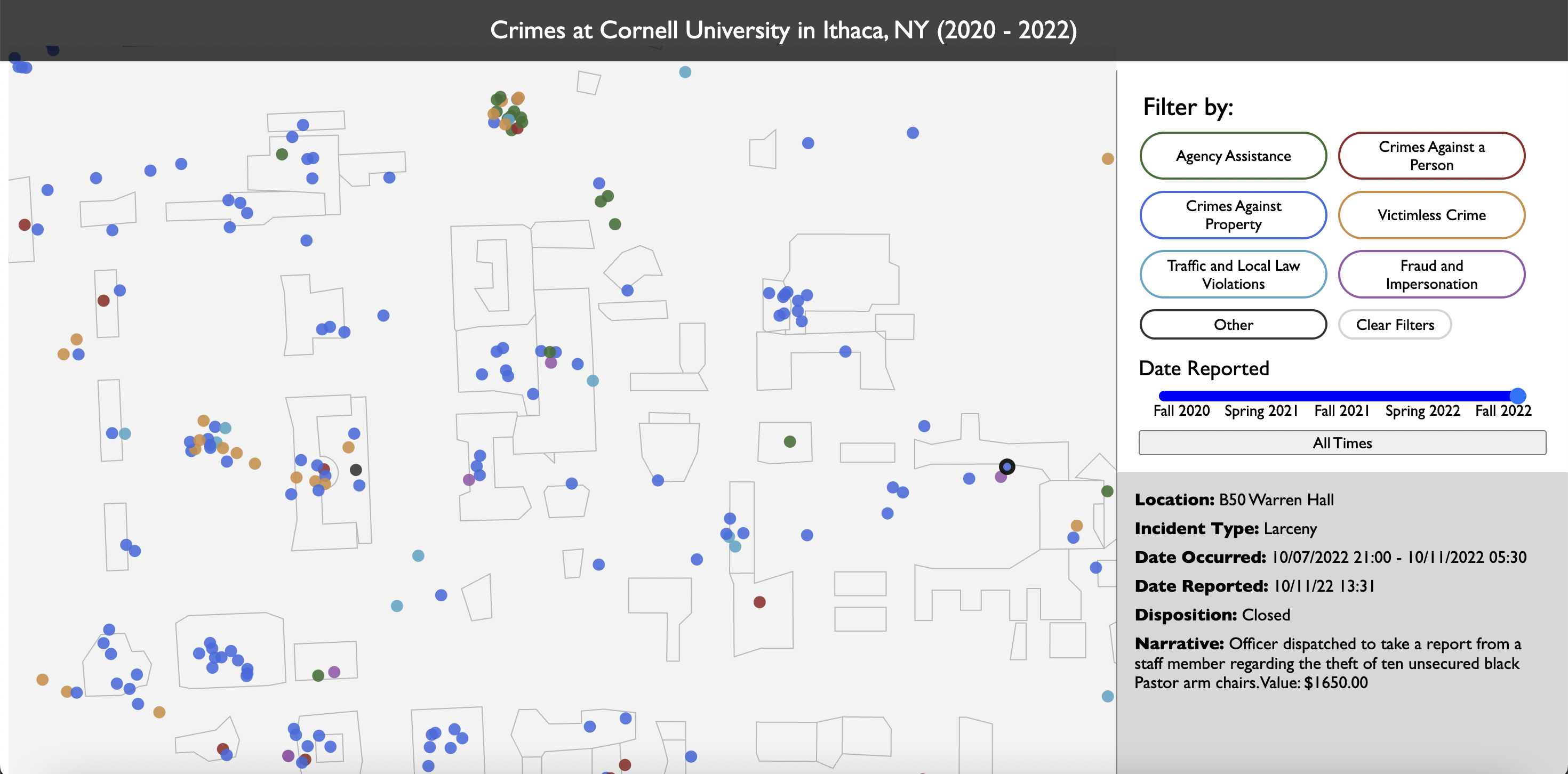
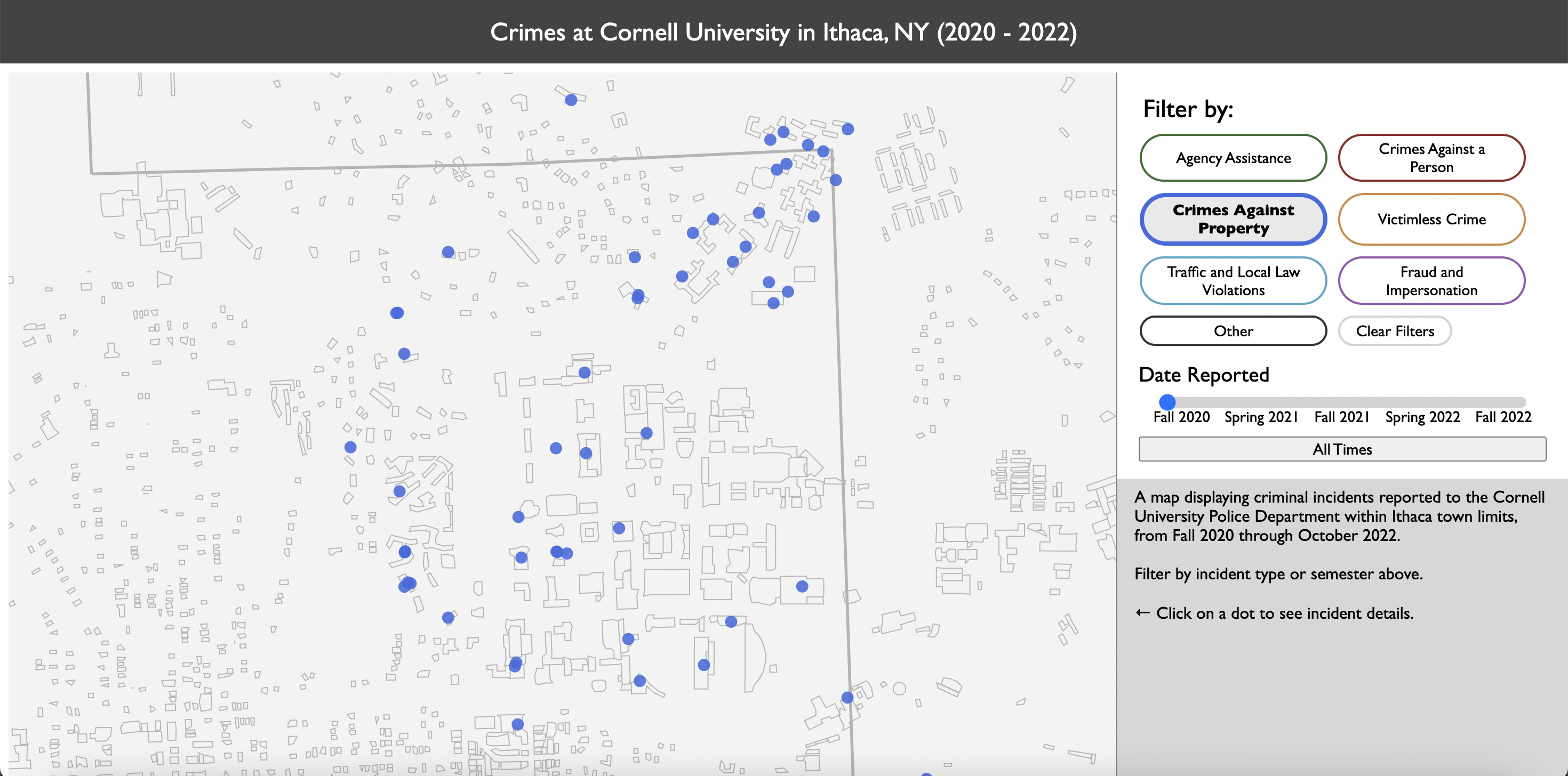
Once we finished cleaning, aggregating, and checking our data, we used D3.js with a TopoJSON file of Tompkins County to create an interactive map of crime incidents that supported filtering by crime type and time, clicking on points to see more information about an incident, and zooming/panning around the map.
I learned a lot from this project by working through creating an interactive visualization from start to finish, including aggregating the relevant datasets, getting through the incredibly time-consuming and sometimes surprisingly complex process of data cleaning, and then finally using nothing but HTML, CSS, and D3.js to create a fully functional map.
While completing our visualization, our team found a number of insights about the data - from the interesting (we could see crime incidents increase in frequency as campus progressively opened up from COVID-19 restrictions in 2020) to the concerning (students were likely unaware of the majority of crimes that were happening) to the entertainingly absurd (I didn't realize that someone had apparently stolen ten armchairs from the lobby next to my economics class last week).
Data-Driven Web Applications was the course that first introduced me to interactive visualization with JavaScript, and a course that I enjoyed so much that it ultimately sparked my interest in pursuing data visualization as a career path. For that reason, even though there's quite a bit I would do differently in terms of design and implementation if I were to revisit this project, I still look back on it fondly as a formative experience.