NCT Network
Visualizing collaborations between pop band singers
I completed this project with one other person for Cornell's INFO 4310: Interactive Information Course in Spring 2024; my main responsibility was implementing the network nodes and styling the diagram. The aim of the project was to take an existing interactive data visualization and recreate it in a new form using D3.js.
After discussing our topic, we decided to reimagine a personal project that my friend had previously completed visualizing the connections between members of the Korean pop band NCT. This visualization was originally created in the form of a chord diagram after manually scraping song data from Wikipedia, Spotify, and YouTube; we thought it would be interesting to see how the same dataset could look like as a network diagram instead.
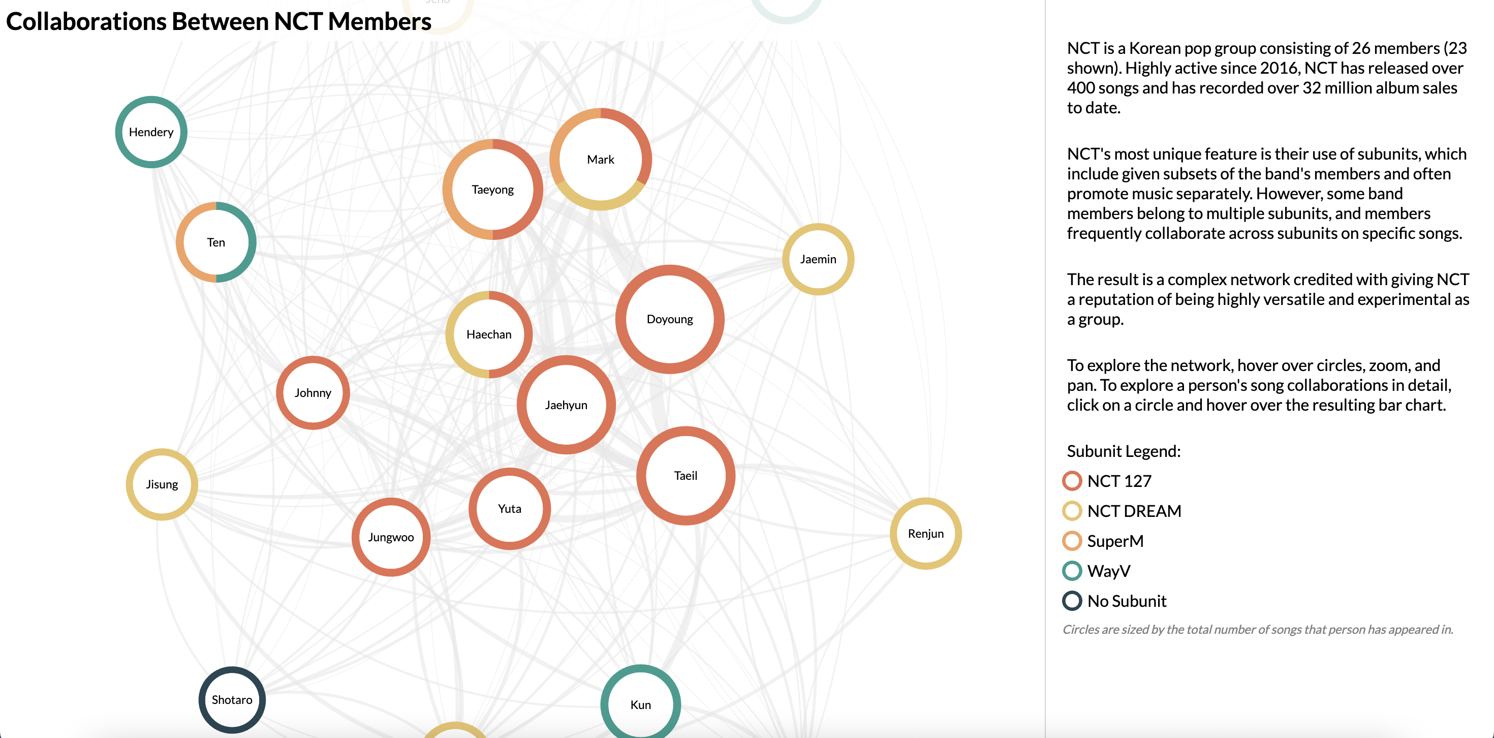
NCT has released over 400 songs since they became active in 2016, and also has a unique number of subunits that often promote songs separately. There are over 20 members in the band, some of whom are in multiple subunits, and collaborations between subunits on particular songs are common. We were interested in visualizing these collaborations across the band as a whole and between subunits; furthermore, we wanted to see the song overlaps between members.
We started out by going over the original visualization and taking note of several key parts, such as the purpose of the visualization, how different kinds of data were encoded, and the trade-offs made in both the visual design and interaction design. We also noted particular strengths that we wanted to retain, as well as weaknesses that we could address in the new visualization.
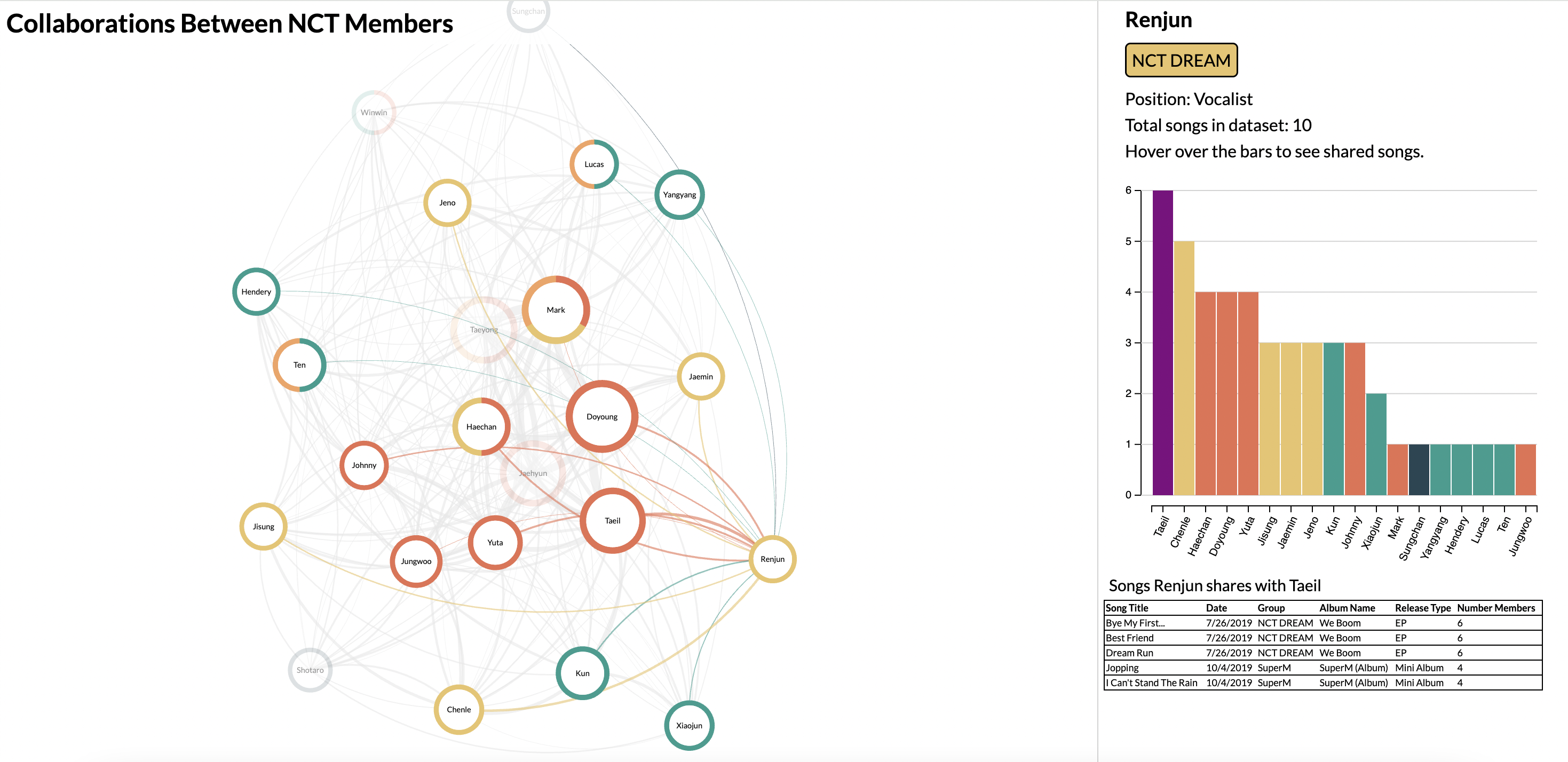
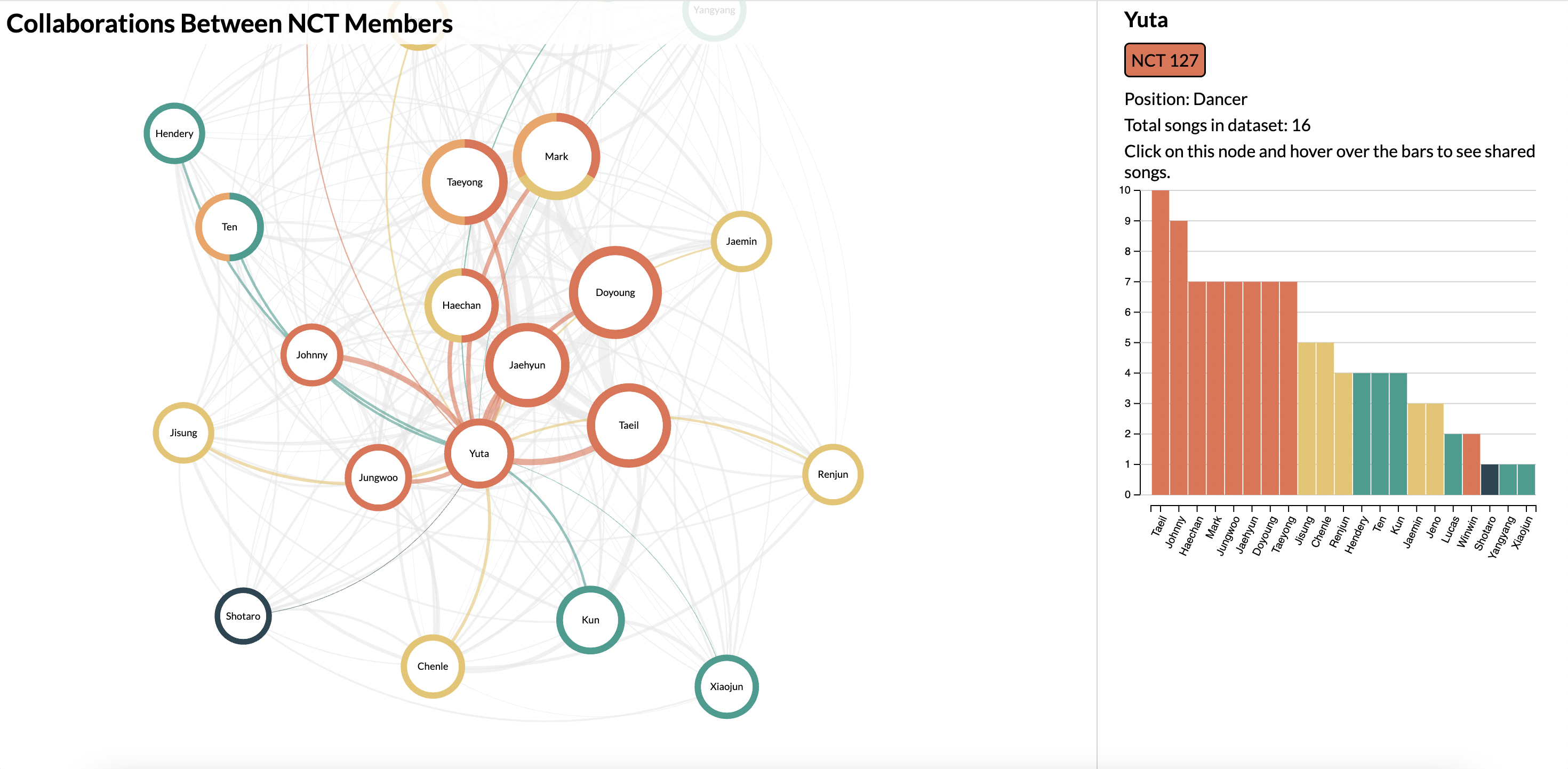
In the current version of the site, users can pan and zoom around a network diagram where each node represents an NCT member and each edge represents songs collaborated on by two members. The size of each node encodes the number of songs a member has appeared on in total, and the border color of each node encodes the subunit(s) that a member is part of.
When a user hovers over a node, the sidebar populates with more information about that member as well as a bar graph showing the frequency of song collaborations with other members. In this way, it is possible to see which members tend to collaborate with each other the most, as well as which members are overall more active in the band.